
DoorDash Feature:
Catering to Every Bite


Introduction
This case study delves into the design process of enhancing DoorDash with an advanced dietary preferences feature. I’ll guide you through the critical design choices and iterations that informed the final prototype, showcasing how a user-centered approach addressed dietary needs with intuitive filtering, customization, and profile management solutions to create a more inclusive and seamless food delivery experience.
Role: Product Designer for a Study Project
Duration: August-September 2024 (75 hours)
Tools: Figma
Key Skills: UX Research, Problem Solving and Ideation, Interaction Design, Information Architecture, Interviews, Visual Design, Usability
Overview
Millions of individuals with dietary restrictions face daily challenges when ordering food online.
from inaccurate menu labeling to limited customization options and the constant fear of cross-contamination. What if food delivery could not only accommodate their needs seamlessly but also empower them to explore diverse cuisines with confidence and ease? This case study delves into the design of an enhanced dietary feature for DoorDash, aimed at making every meal accessible, customizable, and enjoyable for all users—regardless of their dietary preferences or restrictions.
My Role
As the designer for this project, I focused on enhancing DoorDash’s usability for users with dietary restrictions. I conducted user research to uncover pain points, designed solutions like advanced filters and dietary profiles, and created high-fidelity prototypes to address user needs. Through iterative testing, I ensured the new features were intuitive and aligned with user and business goals.
Proposed Solution
The proposed solution enhances DoorDash with a tailored dietary filter system, empowering users with dietary restrictions to navigate food delivery effortlessly. The solution includes advanced filters, customizable meal options, and personalized dietary profiles to streamline the ordering experience. By combining intuitive design with user-driven insights, this feature aims to make dining accessible, inclusive, and stress-free for everyone, while fostering trust and reliability in the platform.
1. Research
2. Define
3. Ideate
4. Design
5. Test
6. Final
1. Research
RESEARCH GOAL
We want to understand how users with dietary restrictions or preferences currently use the food delivery apps and what challenges they face, so that we can design an effective feature that improves their user experience and increases their engagement with the platform
COMPETITIVE ANALYSIS


Key Insights
Most platforms offer a comprehensive project library, clear instructions, and search functionality.
Video tutorials are becoming increasingly popular, with most platforms offering them.
Project planning tools are largely absent from these platforms, representing a potential area for innovation.
Community forums or Q&A sections are not universally offered, but are present on iFixit and Houzz.
User profiles and progress tracking are primarily found on the retail apps (Home Depot, Lowe's) and Houzz.
Personalized recommendations and interactive elements are less common, with Houzz being the notable exception.
QUALITATIVE RESEARCH
Method
Created a semi-structured interview guide to explore users experiences, motivations and challenges.
Conducted 5 moderated interviews
Participants
5 users participated
3 users with specific dietary need
2 family/friends who order for others that have dietary restrictions
2. Defining the Problem
AFFINITY MAPPING
After conducting user interviews, I created an affinity map to organize insights, identify recurring themes, and uncover key pain points and opportunities related to dietary preferences in food delivery.
Key Takeaways

01 Trust in Dietary Information is Inconsistent
Users expressed varying levels of trust in the dietary information provided on delivery apps. While some relied on familiar restaurants for accuracy, others frequently called restaurants to double-check, especially for serious conditions like celiac disease. This highlights the need for a reliable, transparent labeling system to build user confidence.
02 Customization Options are a Priority
Many users emphasized the importance of being able to customize orders, such as removing certain ingredients or substituting others to meet dietary needs. The lack of clear customization options on apps often led users to contact restaurants directly, adding frustration and unnecessary steps to the ordering process.
03 Multi-Ordering Dynamics Add Complexity
Users who ordered for households or partners with different dietary needs found it challenging to navigate options. Balancing preferences often involved additional labor, like manually checking menus or switching between apps, underscoring the need for solutions that simplify ordering for mixed-diet groups.
04 Emotional Triggers Influence Usage
Several users associated food delivery with emotional triggers, such as stress or a desire for convenience after a long day. However, they often faced decision fatigue due to overwhelming options and poor filtering systems, indicating an opportunity to streamline the experience and make it more intuitive.
TARGET USERS
Using the synthesized data from my interviews, I created 3 personas to reflect the nuanced motivations, goals, and pain points of real users.
OPPORTUNITY
Once I had a clear picture of the problems and insights, I was ready to explore opportunities for design solutions.
PRIORITIZATION
Determining the core features for the MVP
Although there were many directions I could have gone, I used the user interviews and affinity mapping to really drive feature prioritization. The goal for the design is to create a product targeted at women, communicates itself in these projects, and has a mentoring componentI consulted with an engineer prior to diving into the ideation phase.
Project Box Library
Tools / Materials lists
Detailed DIY instructions
Virtual Mentor Sessions
Project Gallery
Community Forum
3. Ideation
1. Setting up Dietary Profile
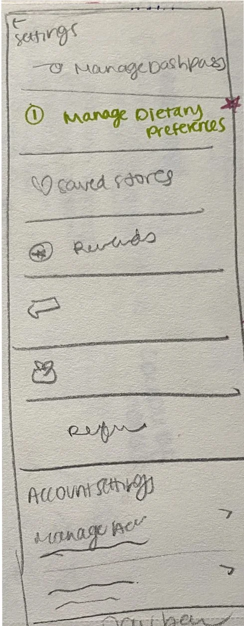
Imagine a first-time user who wants to ensure their dietary needs are always considered when ordering. They navigate to the profile section, intuitively find the "Manage Dietary Preferences" option, and select their specific restrictions, such as vegan and gluten-free. With just a few taps, the system saves their preferences, seamlessly customizing their future experience. This feature gives the user peace of mind and sets the stage for a personalized, hassle-free meal discovery process.
2. Continue progress on a current project that you’ve got a box for already
Picture a user browsing a restaurant menu, eager to enjoy a meal that fits their dietary restrictions. They select a dish and are presented with customization options, such as adding extra vegetables or removing allergens like peanuts. The interface provides clear ingredient details, allowing the user to make informed choices with ease. If needed, they substitute specific items, such as replacing regular noodles with gluten-free ones. With their customizations complete, the user confidently adds the tailored dish to their order, assured it meets their dietary preferences. This streamlined process reduces stress and builds trust in the platform.
3. Filtering Restaurants for Dietary Restrictions
A user opens the DoorDash app, ready to find a restaurant that caters to their dietary needs. They navigate to the restaurant list and open the filters menu, selecting specific dietary restrictions like vegan, gluten-free, or nut-free. With a quick application of the filter, the app presents a tailored list of restaurants that meet their criteria. If the initial results don’t satisfy their preferences, the user adjusts the filters to refine the search further. Once they find a suitable option, they confidently select the restaurant, knowing the menu aligns with their dietary requirements. This efficient process ensures a stress-free and personalized experience, turning food ordering into a seamless activity
4. Design
LO- FI WIREFRAMES
From Flaws to Features: Ideating a More Inclusive Dining Experience
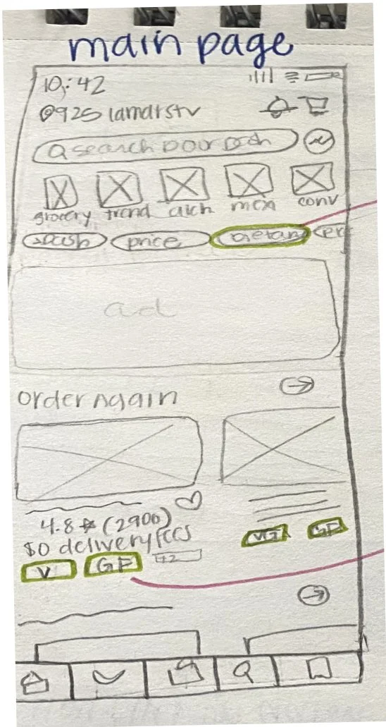
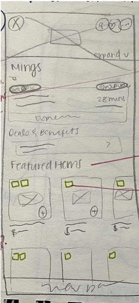
To begin ideating solutions, I first conducted a thorough analysis of DoorDash's current design to identify gaps and opportunities related to dietary preferences. This analysis highlighted issues such as limited visibility of dietary filters, inconsistent labeling of menu items, and a lack of customization options for users with dietary restrictions. Armed with these insights, I developed low-fidelity wireframes to explore ways to address these challenges. These wireframes focused on enhancing the user journey by incorporating clear dietary filters, intuitive customization options, and better labeling to ensure users could confidently find meals that aligned with their needs.
This wireframe highlights a seamless flow for managing dietary preferences. From the “Me” tab, users can easily navigate to “Manage Dietary Preferences” and select options like vegan, gluten-free, or allergies. The design prioritizes accessibility and customization, streamlining dietary onboarding.

This wireframe shows seamless integration of dietary filters, allowing users to toggle options like “vegan” or “gluten-free” and view results dynamically. Intuitive tags and pop-ups enhance usability, helping users quickly find suitable options.
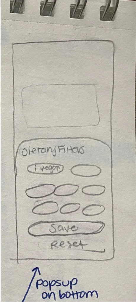
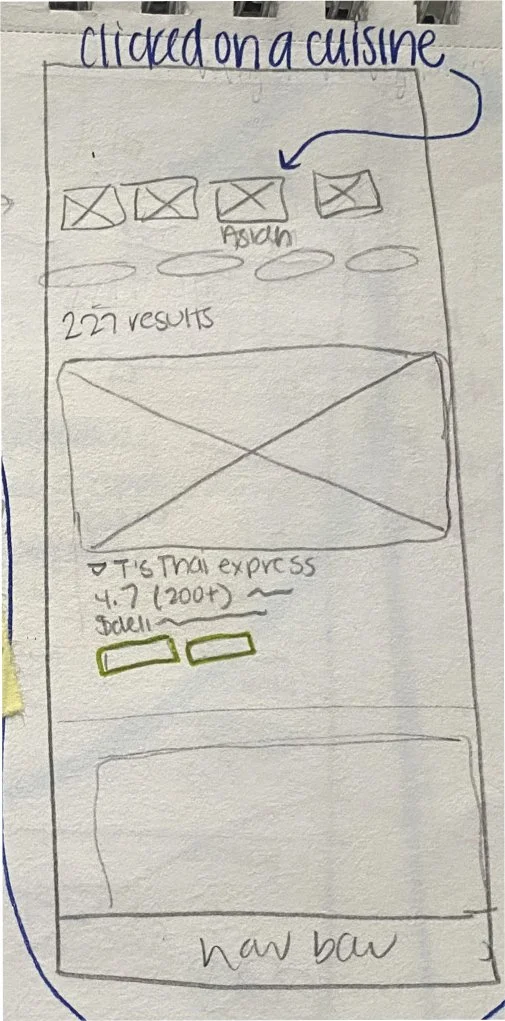
This wireframe shows how dietary filters like "vegan" or "gluten-free" integrate seamlessly, with dynamic results and intuitive tags to help users quickly find suitable options.

HIGH FIDELITY DESIGNS
1) Simplified Personalization
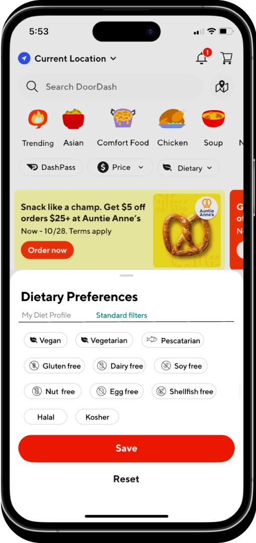
The high-fidelity wireframes prioritize clarity and ease of use, allowing users to quickly select dietary preferences like vegan or gluten-free through grouped checkboxes and a prominent "Save" button. These changes simplify navigation and ensure users can confidently set their preferences, reducing friction in the setup process.

2) Faster Decision-Making
The high-fidelity filters integrate seamlessly into the search flow, with dietary options like vegan and gluten-free easily accessible. Icons and tags next to restaurant names improve clarity, while live feedback on filter results ensures users can make quick, informed decisions without guesswork

3) Clear and Transparent Modifications
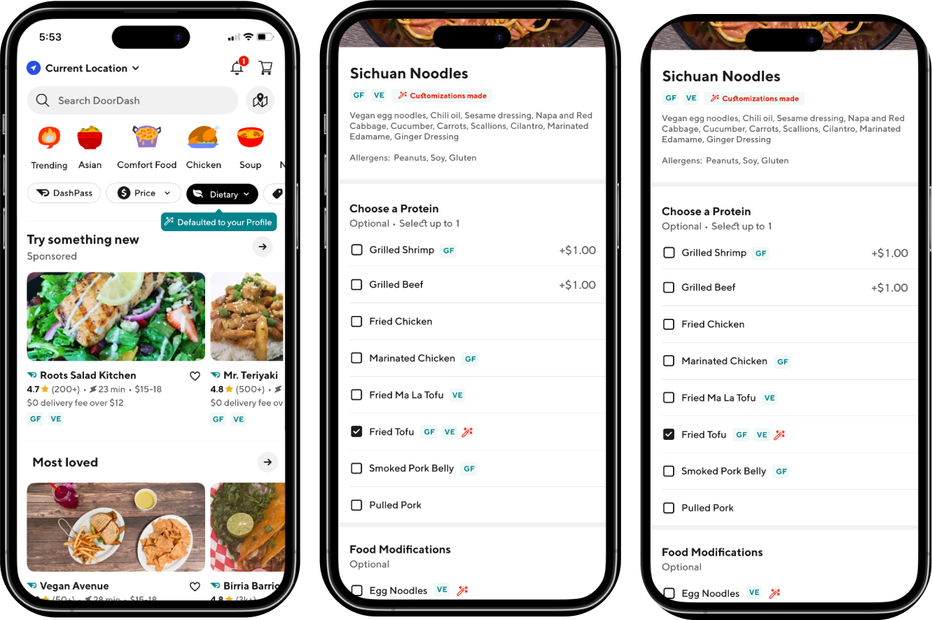
The customization wireframes focus on transparency with features like a magic wand icon to highlight substitutions and tooltips explaining dietary changes. Color coding and a confirmation step enhance trust, ensuring users feel informed and in control of their order modifications.
5. Testing
USER TESTING
Testing with high-fidelity prototype.
I tested the prototype with 5 participants for the user testing. Each session was approximatly 40 minutes and was conducted as a moderated, remote test. The learnings from the testing informed iterations that were made to make the usability more intuitive and clear.
Tasks to Perform
Filter restaurants and menu items based on specific dietary needs such as vegan, gluten-free, or nut-free.
Customize a selected menu item (e.g., substitute gluten-free bread, remove cheese, etc.).
Task: Save and use dietary preferences in the user profile, and apply them to filter and recommend suitable options.
Testing Goals:
Ease of Use: Can users easily find and use the advanced dietary filter feature to find suitable meals?
Customization Options: Can users easily customize menu items based on their dietary preferences?
Communication of Dietary Needs: Can users effectively communicate specific dietary instructions to restaurants?
User Satisfaction: How satisfied are users with the overall experience of filtering, customizing, and ordering meals?
Success Metrics:
Task Completion Rate
Metric: Percentage of participants who successfully complete each task without assistance (goal: 90%+).
Error-Free Rate
Metric: Percentage of participants who complete tasks without making significant errors (goal: 85%+).terminology, or difficulty finding information.
Usability Satisfaction Score
Metric: Average score from post-task ratings on ease of use (goal: average of 4 or higher on a 1-5 scale).
4.Feature Adoption Likelihood
Metric: Percentage of participants who indicate they would use the dietary profile and customization features regularly (goal: 80%+).
Testing Takeaways
Overall Experience
Filter Visibility: Some participants did not immediately notice that dietary filters were pre-applied, causing initial confusion.
Icon Clarity: The "magic wand" icon for customized items was unclear, leading to uncertainty about its meaning.
Favorite Restaurant Recognition: A few participants struggled to identify their favorite restaurant due to unfamiliarity with the heart icon.
Confidence in Customizations: Participants expressed a need for more reassurance that their meal customizations aligned with their dietary needs, without overloading the UI.
Main Pain Points
Filter Visibility: Some participants did not immediately notice that dietary filters were pre-applied, causing initial confusion.
Icon Clarity: The "magic wand" icon for customized items was unclear, leading to uncertainty about its meaning.
Favorite Restaurant Recognition: A few participants struggled to identify their favorite restaurant due to unfamiliarity with the heart icon.
Confidence in Customizations: Participants expressed a need for more reassurance that their meal customizations aligned with their dietary needs, without overloading the UI.
1) Set it and Forget It Confirmation
After setting up dietary preferences, a confirmation message now assures users that their preferences are automatically applied. This iteration reinforces user confidence and eliminates potential uncertainty about the functionality of saved settings.

2) Filters, Front and Center
A clear visual indicator on the home screen now highlights active dietary filters. This enhancement ensures users can instantly recognize when their preferences are being applied, minimizing confusion and improving transparency.
Before
After

3) Lack of clarity on mentor session logistics
Some users were unsure how they would connect with their mentor after booking a session.
To make it clear, on the final confirmation page, users will now see that the connection is virtual via web conferencing.
Before
After

Doordash Feature Final Design
6. Reflections
Takeaways
This project highlighted the critical balance between user trust, transparency, and intuitive design when addressing dietary needs in a food delivery platform. For me, it was also personal. I have a gluten allergy and use DoorDash all the time—but I’ve gotten sick more than once because of mistakes in orders. Did you know soy sauce has gluten in it? I didn’t, until it caused a problem. I was surprised DoorDash doesn’t already have a feature like this, especially given how many people rely on the app for meals that meet their dietary needs.
While working on my mockups, I had to call a restaurant to get detailed information about their ingredients and allergens. The process reminded me just how time-consuming and stressful it can be when you’re trying to balance convenience with health concerns. It also gave me a deeper appreciation for the complexity of designing a platform that manages hundreds of options while ensuring the right level of transparency and trust for users.